The Bar Chart
Now there are a couple of ways that you can look at all these numbers still using just one chart. One way that was used for many years by Western traders is called a bar chart, or sometimes an OHLC chart, standing for opening, high, low, closing. The bar is a vertical line for the day, which stretches from the lowest price seen up to the highest price. Coming into the bar on the left is a little dash called a tic which is at the level of the opening price; going out of the bar to the right is another little dash which shows the closing price. Here’s a typical bar chart.

You can see that it has the same general shape as the previous chart, the line chart, but on each day there is the vertical bar showing the high and low price levels on that day, plus little lines on the left and the right for the open and close. Here’s a blow-up so you can see those more clearly.

As you can see, there is a lot more activity shown on this graph than on the simple line. To further emphasize this way of drawing, look at the two bars on the extreme right. The one on the left, the long one has the left tic, the opening price, at the top and the right tic, for the closing price, at the bottom. So that day the price opened at the highest level it was during the whole day, and closed at the lowest level it sank to. On the extreme right, the bar goes from high to low levels but the tics are almost the same, in the middle. So that day the price started just below the previous day, went up and down during the day, but finished at more or less the same price as it started.
It is really important that you understand this type of chart, as you’ll see it a lot. You will find out that it tells you much more than a line chart – you probably already realize that a price that varies a lot in one day tells you something very different from the price which stays around the same.
The Candlestick Chart
For many years, even before computers, Western traders used to use bar charts when studying the markets. However, in 1987, an analyst called Steve Nison was working in a brokerage house. He became familiar with a Japanese broker who was looking at Japanese stock chart books. She said, “Look, a window.” He asked her what she meant, and found out that the Japanese window was what is called a gap in Western technical analysis – which we’ll talk about later. They went on to discuss other differences with Japanese charting, and Nison studied it for another three years before producing his first book on what we call candlestick charting, “Japanese Candlestick Charting Techniques.” Nison continues analysis and educating to this day, and is regarded as the father of candlestick charting in the Western world.
Candlestick charts actually show you just the same as bar charts in terms of information, but they are much more easily interpreted. For instance, with the bar chart you may have noticed that it wasn’t immediately obvious which were updays, that is where the price closed higher than it opened, and which were downdays, where the price closed lower than the opening. An upday tends to imply optimism on the part of other traders, and shows a very different market sentiment. With candlestick charts you can easily see from a distance which are up and which are downdays, and so they are the preferred type of charting for many traders.
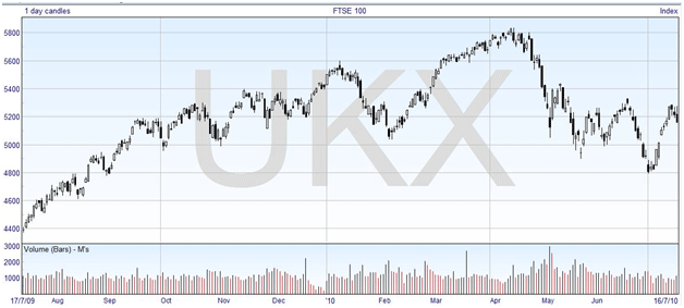
Here is the candlestick chart of the previous bar chart.

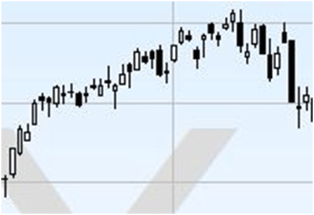
And here is a close-up of the same April peak -:

The vertical rectangles are called the “real bodies” of the candlesticks. The lines that sometimes stick out above and below are called the “wicks”. The name candlestick is because, sometimes, the configuration looks like a candle. You will notice that sometimes the real body is white, and sometimes it is black, and this is one of the keys to understanding what information candlestick charts are revealing.
Just as with the bar charts, you can see that there are four price levels depicted by each candlestick, even though some of them may be coincident. You have the top and the bottom of the real body, and you have the top of the top wick, and the bottom of the lower wick. As you might expect, the top of the top wick is the highest price level reached on that day, and the bottom of the lower wick is the lowest price.
But the clever part is the real body. The top and bottom show the levels of opening and closing prices, and the colour shows whether the opening price is at the top or the bottom of the real body. If it is an upday, with the closing price higher than the opening price, then the real body is white. If it is a downday, then the real body is black. Here’s a diagram that summarizes that.

See how much easier it is to interpret the candlestick chart at a glance. You can usually customize the colour of the candle body if you want to, and another often seen colour combination has a green body for a upday and a red body for a downday. Again, you don’t need to worry about drawing these as websites and software will do it for you; all you have to do is interpret what you see.
Now that you know what it means, look back at the bigger charts. You can see how in an uptrend on the left-hand side and in February and March there are a lot of white candles, showing most days the price finished higher than it started, as you might expect. You can also see that some black candles started happening just before the uptrends finished, at its most basic interpretation showing that the price did not stay up throughout the day. There’s a lot more to learn about candlestick charting and patterns that you will find, but we’ll leave that for another chapter.

Leave a Comment